Spectrum Coffee is a new roasting company out of Brooklyn. The folks at Spectrum have been roasting out of the Pulley Collective in Red Hook for three years with the hopes of opening their own space sometime in 2019. Spectrum roasts coffee from Nordic Approach, Collaborative Coffee Source, and Bodhi Leaf Coffee Traders. You can find their coffees at cafes like L’impremerie, Babydudes, Cafe Beit, and their sister cafe Dweebs out of Bushwick.
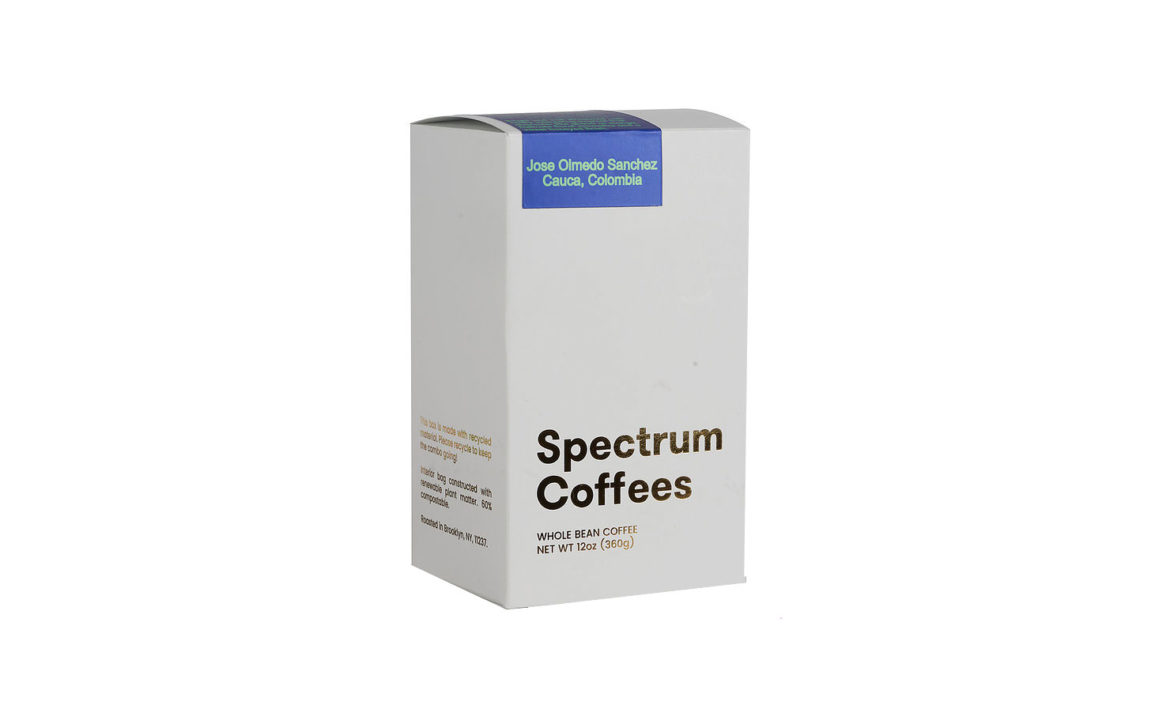
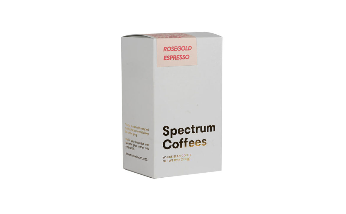
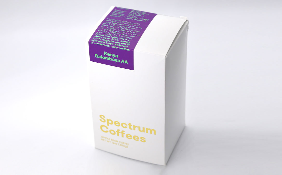
Spectrum packages their coffee in Biotre bags housed in a sturdy white box with clean lines, gold foil, and a pop of color on the top. All of the coffee information is kept in a tidy colorful band that distinguishes the type of coffee. The design process was a 50/50 effort between the Spectrum team and their designer friends. We reached out to Will Douglas and Sam Stoothoff digitally to learn more.
When did the coffee package design debut?
This most recent iteration released about a month ago. We’ve sort of been improving our packaging piecemeal since we started a few years ago. We’re pretty happy with it now, but as I’ve learned in this process, at least for me, I like change. I love working with people on new designs and the little sparks of idea you get in the shower that have to get translated into reality. We always looking to improve though, and through this design we already have fun new things we want to try next time.
Who designed the package?
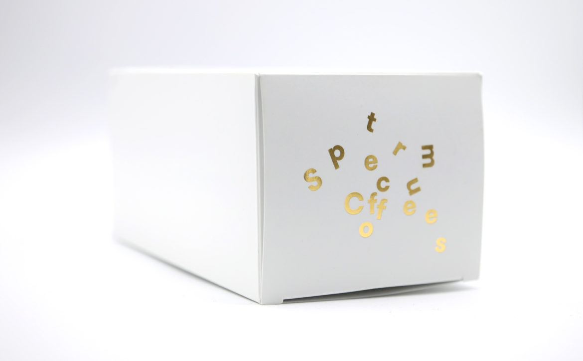
The design was about 50% in house, 50% friends. We were lucky that one of our employees’ brother, Matt Varner, worked at a prominent design firm in New York. He created our logo font and layout, and we took it from there. The “scatter” logo on the bottom of the package was done by our friend Kaela Chambers, an independent artist in Jersey City.
The coffee information is on a wrap around the box—what kind of information do you think is important to share with the coffee drinker?
That’s been an interesting point of discussion for us. We include all the basics, like elevation, process, varietal, producer, etc. Something we’re interested in doing soon is including the price per pound that we paid for the coffee. Transparency is cool, but it needs context. A lot happens along the way to bump up the retail price, and we’re working on a way of communicating that so our customers know what they’re paying for. Cupping score is another metric we’re thinking about adding to the label. We’re figuring out how to present it so that consumers understand how the score fits in the bigger picture. A lot happens along the way that affects price, for instance, Costa Rica has a high minimum wage (cool and good) which leads to a more expensive final product that may score equal to a cheaper Colombian coffee. If you’re reading this and have thoughts, please reach out, we’d love to hear your ideas about what label info you’d be most interested in seeing!
Why are aesthetics in coffee packaging so important?
Coffee is fun and beautiful and deserves to be presented as such. If it weren’t dangerous and probably illegal we’d put one of those dumb party poppers in every box that would shoot confetti in your face the first time you open it.
Tell us the specifics on the design details.
The labels on the coffees are polypropylene. With our old retail design we needed something that wouldn’t rip. With this new one we’ll be switching to paper labels since they’re more environmentally friendly. We used a company called Packwire for the boxes. They were really nice to work with and manufacture in Canada. For a slightly higher price per unit we cut out an entire transpacific voyage compared to having them made in China. The gold foil is Crown #170 from Crown Roll Leaf.
The box itself is recyclable and the Biotre bag inside is 60% compostable. What 40% isn’t.
The innermost lining of the Biotre bags aren’t compostable, but they use an additive that allows them to break down in 5-10 years. The outermost two layers are totally compostable.
Where is it currently available?
Online or at one of our dope partners in Brooklyn and Manhattan.
Thank you!
Location: Brooklyn
Country: United States
Designer: Matt Varner & Kaela Chambers
Zachary Carlsen is a co-founder and editor at Sprudge Media Network. Read more Zachary Carlsen on Sprudge.
The post Coffee Design: Spectrum Coffee In Brooklyn, New York appeared first on Sprudge.
from Sprudge https://ift.tt/2TPDWw0
No comments:
Post a Comment